Discover how today’s most successful IT leaders stand out from the rest. Read the report
Teamwork is beautiful: Introducing Asana’s new look

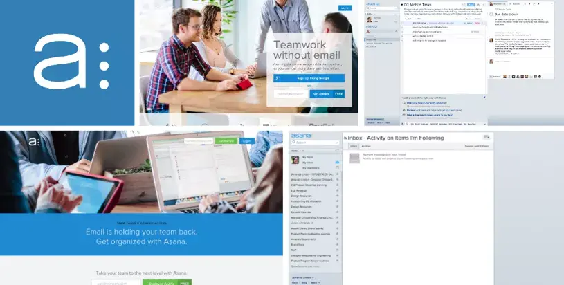
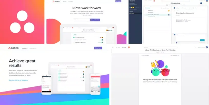
We are having an exciting week at Asana: not only are we rolling out a completely redesigned product, but we’re also unveiling a new logo and brand identity. All our sites and apps now have a vibrant new look, with the aim of making Asana as beautiful as the teamwork that it enables.
It’s a makeover a long time in the making, and a lot of love went into it. We hope it shows.
Why a rebrand?
Asana is on a mission to help you and your team do great things together. By making it easy to keep track of your work, we give you more time to do the work that matters: building software, curing patients, cooking meals, or whatever it is your company does. That’s what gets us up in the morning.
About a year ago, we looked at our brand and realized that we just weren’t conveying who we are or what we stand for. We’ve also grown rapidly over the last year, so it became more important to define our brand to create a sense of consistency across our teams. Our goal was to make everything that you interact with–from our product to this blog– more representative of who we really are. But who are we?
Determining who we are
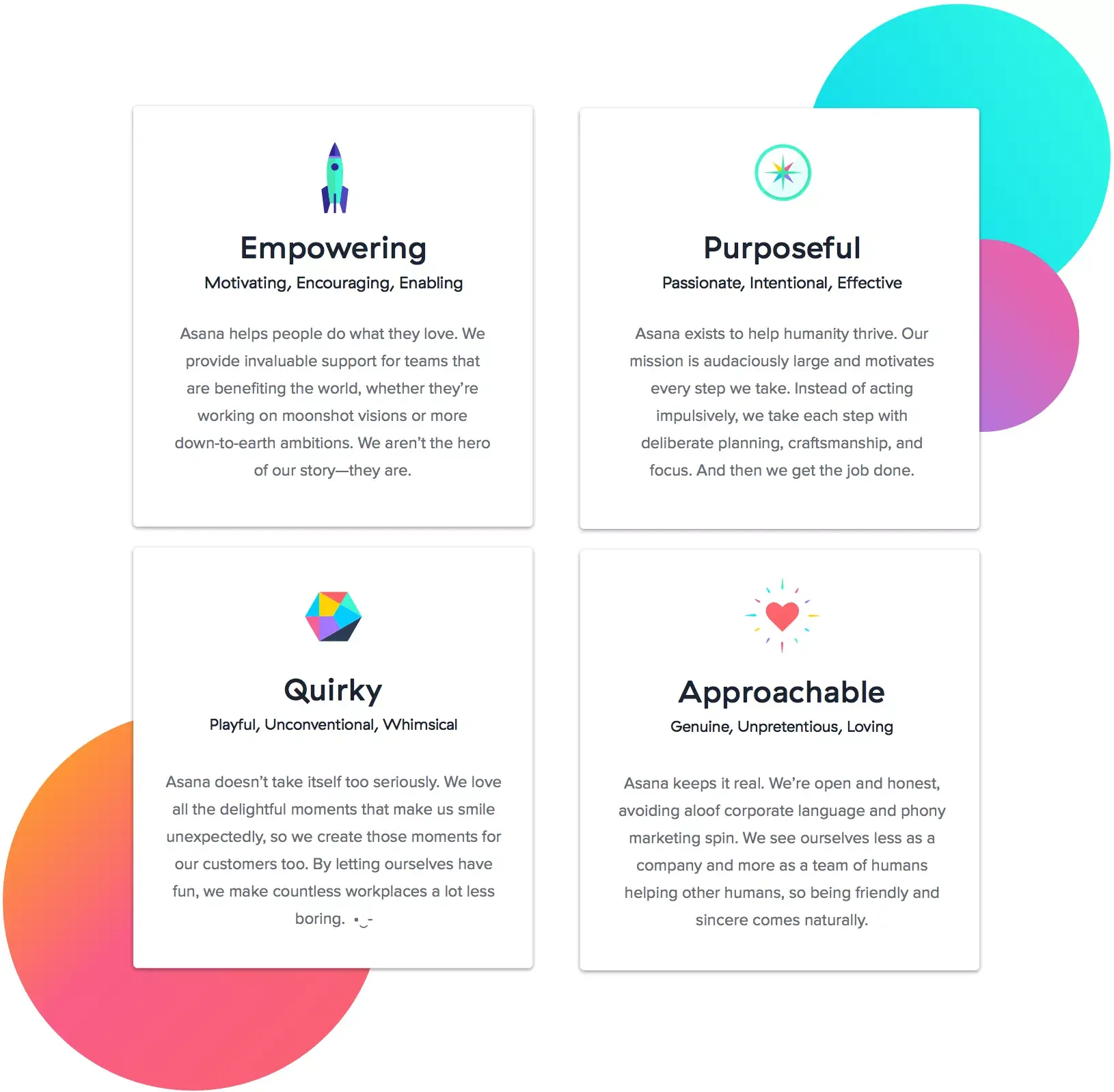
We asked ourselves: “If Asana were a person, how would you describe them?” and came up with four brand attributes:
In the process of defining these, we gathered members of the company from across product, marketing, design, and engineering to align on the qualities we want to convey. When assessing a new design or piece of writing, we can now hold it up next to our attributes and ask: “Does this convey who we really are?”
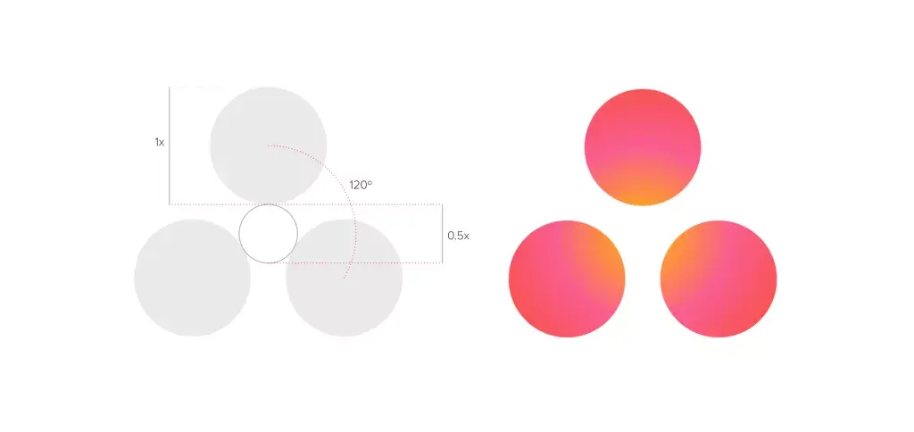
Evolving the three dots
In setting out to create a new logo, we knew we wanted to capture the spirit of collaboration in a simple, iconic form—a symbol that would represent teamwork for many years to come. We partnered with Moving Brands to find that symbol, and couldn’t be happier with the results.
Our three dots are still there, but they are arranged in an important new way:
Three dots used to patiently wait in line at the deli counter, but now they’re working together on a common goal. Instead of a cool green, they’re now an empowering, warm coral, with a glow that conveys the active energy between the team. The letter forms, placement, and arrangement of our logo were crafted with purpose. If you look closely, you’ll notice that there are three dots equally spaced inside the “A” letters in our word mark.
Balancing clarity & energy
Once we had a new logo, we worked to extend that out into a brand system—a collection of colors, shapes, fonts, and patterns that make everything Asana feel like Asana.
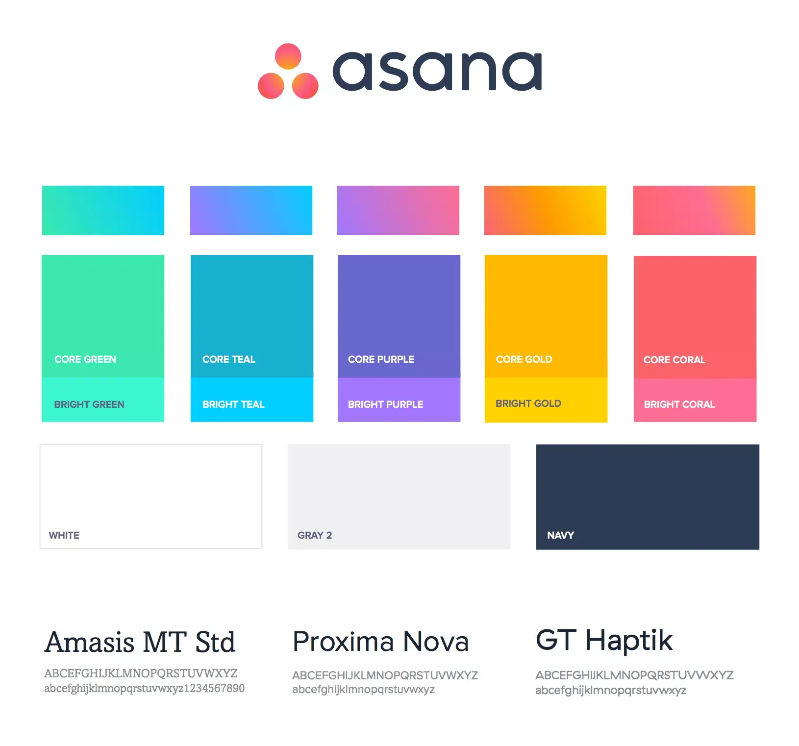
We decided that we wanted Asana to feel like clarity punctuated by energy.
Clarity is the feeling of being on top of things, of knowing exactly what you need to work on at any given time. Clutter and confusion are swept away, so you can see all the way to the horizon.
Energy is the feeling of making progress, of running toward that horizon and knowing you have the strength and endurance to make it. And it’s the celebration once you get there.
Clarity is a clean white canvas for your work. Atop that canvas, we inject energy with bursts of color in those fulfilling moments when you take action and move work forward.
In other words, the new Asana may be a lot more fun and colorful than the old Asana, but we’re being very intentional about how we use that color, so it never disrupts your focus. Complete a task or clear your Inbox, however, and you’ll get a fun little celebration in return. And for an even more magical moment, be sure to enable the Unicorn Hack!
For a more in-depth look at how we rebranded Asana, check out this Medium post.