Color your productivity: Asana now adjusts for color-blindness
According to the National Eye Institute, up to 8% of men and 0.5% of women have some degree of color blindness. That means that in a group of eight men and eight women on your team, there’s a 50% chance that at least 1 teammate is color-blind. While there are several different types of color blindness, all individuals who are color-blind rely on cues like shapes or semantics in situations where they could otherwise rely on clearly differentiated colors, like when waiting for a traffic light to turn “green.”
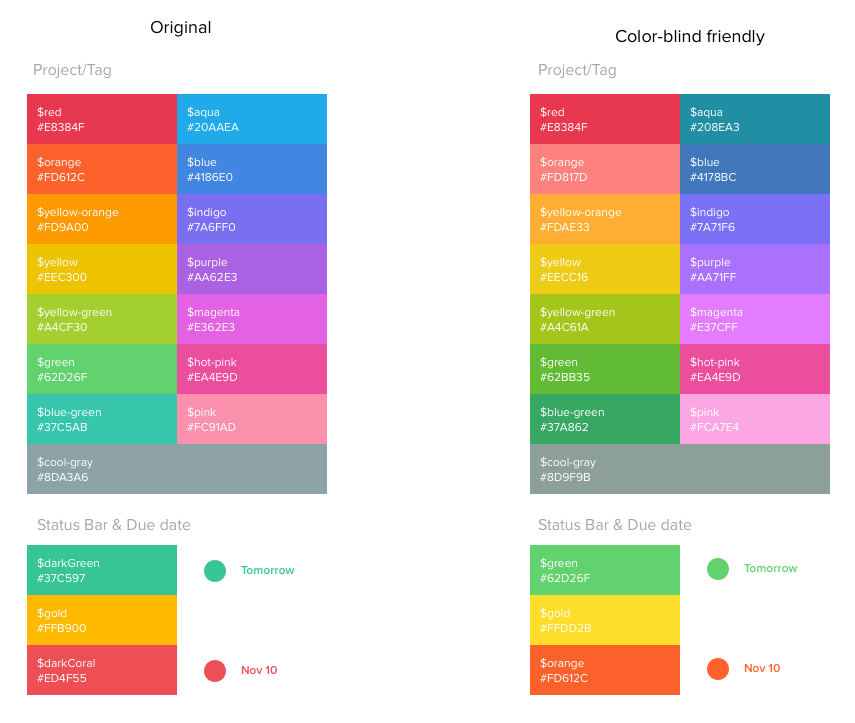
Seeing Asana’s true colors
In order to get the most clarity from Asana, you need to be able to use every feature of our product with ease. Until now, colors—like those in projects, tags, and overdue tasks—were only useful to color-seeing users. Now, anyone using Asana can turn on color-blind mode and the app will color-map our existing palette to one that is color-blind accessible. Due dates that are past due also appear in bold in color-blind mode. This is particularly helpful for people who work with a lot of due dates—like Terrence, who works on our User Operations team.
To turn on this feature, click on your profile photo from the top bar and select “My Profile Settings” from the drop-down menu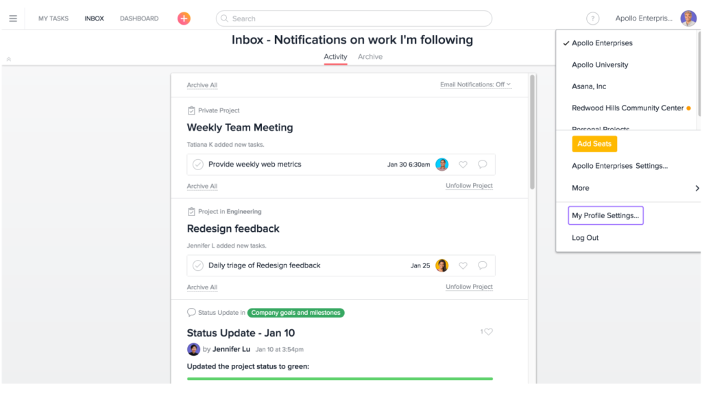 From your Profile Settings, click on the Display tab and check the box that reads “Enable color blind friendly mode (protanopia and deuteranopia)”
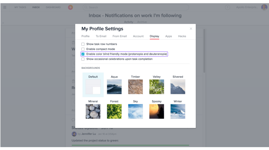 Tip: “My Profile Settings” gives you the ability to customize your Asana account to work best for you, including adding or editing your “about me” section, setting yourself as away when you’re on vacation, and customizing your display background. Learn more about how to update your Profile Settings.
Adding some color to the story
Yang, one of Asana’s mobile engineers, is color-blind. He has Deuteranopia, or a red-green color deficiency. Yang grew up in China, where certain paths of study are restricted based on color blindness, so he’s familiar with some of the challenges of being color-blind.
Since joining the user interface (UI) and experience (UX) team at Asana, his work often includes working with designers and multiple colors in order to deliver the product that you know today. Because of his color blindness, working with colors within the product has always been a challenge.
Yang explains, “I’ve been shown colors and asked, ‘Is this supposed to be green?’ to which the designer responds ‘No, it’s corange!’” He also relies heavily on project tags, which he often struggles to discern from one another. In addition to project tags, features like due dates and custom fields all use color to provide information, status updates, or clarity to our users.
During a recent hackathon, a teammate suggested that Yang work on making Asana color-blind friendly, and he jumped at the opportunity to work on a problem that he has a lifetime of experience with.
The process of creating a colorblind friendly Asana
To begin the process, Yang began by researching other tools that have color-blind modes, like Slack, and read academic papers to give him a framework for mapping out the problems. Having earned a PhD in image processing, Yang is no stranger to color and image mapping—or research papers.
In the end, Yang found that there are two options to make colors in Asana discernible to the color-blind eye: he could either create an entirely new color palette that is color-blind friendly and have everyone that uses Asana use this color palette, regardless of whether they are color-blind or not, or he could map the existing color palette to something that is color-blind friendly and provide two different modes—one for color-seeing and one for color-blind users.
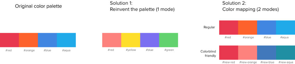
Because Asana has many areas of color—like text and tags—reinventing a new color palette would have made the app look completely different, so Yang decided to work with color mapping. Color mapping is the process of transforming image colors using an algorithm—in this case from a palette of colors that are invisible to the color-blind eye to a palette of colors that can be seen.
While implementing this feature, the biggest challenge came from agreeing—or not agreeing—on color choices. Since there are so many different types of color blindness, nobody’s color vision is exactly the same, so the team had to find ways to create one solution that satisfies most users.
If you’re color-blind, go ahead and update your settings in Asana to color-blind mode and let us know if you like what you see! If you’re an engineer who’d like to work on interesting projects that present complex challenges and lots of learning, we’d love to hear from you. Finally, if you have suggestions on how we can make the app more accessible, we’d love to hear them in the comments.