Our new blog design
As you might have noticed, earlier this month we launched a new blog design. This is something we’ve been looking forward to for a long time. Our blog is where we most directly express our personalities and values, so we wanted its design to be something we get excited about. Our other goals for the redesign were to make the blog more flexible, more readable, and better for commenting.
More Flexible
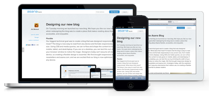
The biggest technical goal of the redesign was to make the design responsive, so that it’s easy to read from any device or screen size. Using CSS and media queries, we can re-flow and shape the content to look great on phones, tablets, and desktops/laptops. If you are on a desktop, you can see how this works: shrink the width of your browser window to notice the magic. We’ve already added responsiveness to most of our email designs and to asana.com, so we’re excited that our blog is now also optimized for all the different screens you use.

More Readable
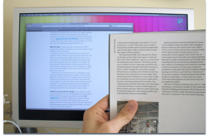
 The easiest thing to notice in the redesign is that we followed the emerging web design trend to increase font size. There are many reasons this trend is happening. First, a larger font size increases readability and accessibility. Secondly, web font sizes have historically been rendered smaller than their point size suggests. A simple experiment by Information Architects determines that 12-point printed type is visually the same size as 16-pixel screen type. In addition to larger fonts, we cleaned out the space around the posts, so that you can really focus on what’s written. We hope you find these changes more pleasing on your eyes.
More Conversation
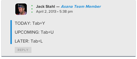
 The Asana blog has always featured a vibrant comments section, but we wanted to foster easier conversation with Asana and our blog authors. In the old blog design, it was very hard to discern which comments came from Asana team members. In the redesign, we added a blue bar and a label to Asana team member comments, so you can quickly scan the comments for answers and feedback from us.
Focused on Posts
85% of our visitors, visit an individual blog post, not the blog homepage. This is mostly due to the rise of social media sharing of ideas and posts. So, we designed the site around single posts, not the homepage. Most web design is done in the opposite way. Usually a homepage is the funnel into your content. We took this knowledge to heart and added forward and back arrows, with post titles, on each post so you can quickly move between posts, without having to navigate back and forth to the blog homepage. For the blog homepage, we prioritized quicker scanning, so you’ll see shorter intros to more posts than before.
We have many smart, funny, and helpful followers of our blog, who actively read, comment, re-Tweet, Like, and immerse themselves in what you read here. We hope the new design makes the time you spend here more productive, and continues to foster inspiration to do great things.

