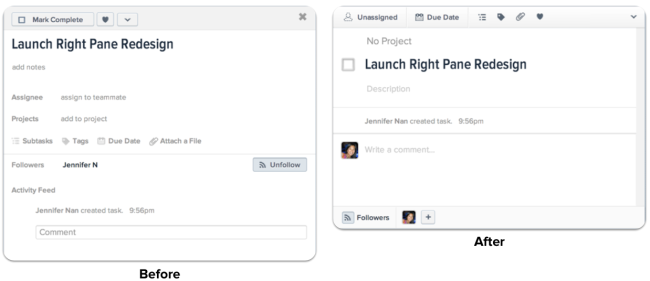
The task pane, redesigned
Asana’s task pane is where you go to manage the details of your tasks, and it is where most of the action in Asana happens. Today, we are happy to announce that we’ve given the task pane’s design a major upgrade.
The new design makes the task pane simpler, more elegant, and more delightful to use, without adding or removing any features. We’ll be rolling out the new design slowly, so you will see it in your Asana account sometime over the next few weeks.

The improvements we’ve made
See critical information at a glance

One of the biggest changes you’ll notice is the toolbar at the top of the task pane. Before, the critical details of a task were strewn across the pane. Now, they key information about a task (Assignee and Due Date) are always visible in the top-left corner of the pane.
Better Collaboration

Asana works at its best when it is used as a communication tool, so we made changes to the look and feel of commenting and following to promote communication.
- We’ve moved task followers to the bottom of the task pane and made them always visible so that you know who is involved in the conversation.
- We switched the display of followers from a list of names to a row of faces so that Asana feels more personal. (If you haven’t added your picture to your Asana profile, you should!)
- We’ve ensured comments always stay on screen when you’re typing in them, even as you scroll up to look at comment history.
Make keyboard shortcuts obvious

Many of Asana’s biggest advocates love the keyboard shortcuts that exist throughout Asana, but many people never find out about them. To address this, we added keyboard shortcut prompts to the tooltips that were already present in the app. We’ve seen some shortcuts quadruple in usage because of this small change.
Cleaner interfaces

In the past, an empty task could feel overwhelming because the task pane was so cluttered. With our redesign, the task pane is much cleaner in its empty state. The pane is also physically smaller, and grows vertically as more information is added into it.
 As part of this change, we’ve reduced the prominence of the “Today/Upcoming/Later” setting, so it is no longer visible all the time. But don’t worry, it’s still there: simply click on the “Assignee” button when the task is assigned to someone the settings will appear. For power users, this feature is still quickly accessible via keyboard shortcuts:
- TAB+Y: Today
- TAB+U: Upcoming
- TAB+L: Later
Improving everyday experiences
We believe that when the tools you use are well designed, you are more effective at what you do. You are able to grok information more clearly, your mind feels less cluttered, and you feel more in control. When you collaborate with others, everyone experiences the same clarity and control, so your team is able to get and stay on the same page.
Most of our users spend a large proportion of their time in Asana using the task pane, so it is important for it to be well designed. We believe that you deserve to look at and interact with something that is beautiful as well as functional.
We’ve been testing the redesign with volunteers, a subset of users, and internally at our company. The feedback has been really positive, so we’re excited to roll this out. We hope you enjoy this change as much as we do.

