Visualizing collaboration at Asana
Collaboration in an organization is a fluid and evolving process. Earlier this year, we dug into Asana’s own data to characterize this process at Asana over the last year and a half. To do so, we created what we’ve termed a “collaboration network” by collapsing the multitude of tasks and projects shared by people into edges connecting users. We consider this a new way to investigate how people collaborate. We’ve turned these networks into visualizations that communicate what our everyday interactions look like over time. This analysis has helped us deepen our understanding of how we work together.
Sneak Peak
To skip the technical information, see Looking at Asana.
 Asana in September 2014. Each node in the network is an Asana employee or heavily-integrated contractor, colored according to their role and sized according to how heavily they use Asana. The edges connecting the nodes are measures of how heavily the two connected users collaborate:
Constructing the networks
From Logs to Networks
The data in this project consist of approximately 500,000 “notifications” generated by Asana employees and contractors in our internal Asana environment during the period from January 2013 to September 2014. We define notifications as a message sent to the user anytime an action is taken on a task: a new comment is added, a task is assigned, or a task is completed. They act as a proxy of collaborative activity; whenever a user takes an action on a shared task, the notifications created act as a historical marker of the collaborative connections that existed at that moment.
We used our mapreduce infrastructure to process notifications from the production logs of our internal Asana instance and loaded them into our redshift database. In python, we summed all notifications between each pair of users (in both directions) for every 28-day rolling window in the period that begins on a Monday (a step size of 7 days). We then constructed a graph in the graph-tool library for each 28-day window. Nodes in the collaboration networks are users, and edges between a given pair of users A and B are weighted, directed edges that are a count of notifications going from A to B during each 28-day period. This results in two edges between most pairs of collaborating users, as will be seen below.
Next, we applied a series of filters to the graphs. First, we removed all bot accounts to focus entirely on user-to-user communication. Next, we filtered out test accounts and one-off contractor accounts by removing any user that created fewer than 120 notifications during each 28-day period. Finally, we removed any users with no connections to any remaining users so that only the core company remained. We played around with removing non-employees from the data as well, but ultimately left them in, letting the 120-notification minimum filter out most of our less-central contractors.
The outcome of this process is 74 networks, ranging in size from 40 users in May 2013 to 90 users in September 2014.
Bringing Meaning to Networks
Using graph-tool’s drawing package (and with some much-needed input from Asana’s incredible design team) we generated visualizations for each network. Node size is a function of relative “loudness” of a user: users who generate a lot of notifications (which reflects taking a lot of actions in Asana) are larger than those who generate fewer. The edges between nodes are also sized according to “volume”: thicker lines represent more total notifications from one user to another than thinner lines. Node color can denote group membership of users, as described below. Edge color reflects the color of the originating user; when there are edges both directions between two different-colored users, they will be different colors as well.
The layout is automatically generated using a force-spring algorithm called sfdp. Roughly, this algorithm treats each node as a point mass (setting the inertia equal to the “loudness” of each user) that repels each other node as if they all had the same charge. Each notification between two users acts as a spring between them that pulls them closer. Thus, as two users collaborate more in Asana, the force attracting them will increase. The algorithm does some clever physics approximations iteratively to find an equilibrium between the repelling charges and attracting springs.
There is, however, very wide variation in the amount of collaborative activity produced by Asanas. The “loudest” members of the company generate more than 100 times the activity of their less-prolific co-workers. Using unmodified edge weights for the springs causes these large users to clump tightly together and the relatively “quieter” users to be flung to the edges.
Transformations of the weight such as square root and logarithm fared no better–the layouts were uninterpretable. From any given user’s perspective, collaboration is a function of relative interaction, rather than absolute interaction. If there is someone from whom I receive half of my inbox notifications, they are as central to my collaborative self whether it’s 20/40 or 200/400. Conversely, if I generate 20 notifications to a particular user, it’s a big difference if that’s the majority of their inbox or a drop in deluge of messages. Updating the weights to a relative value (expressed as a percentage of the total collaborative activity of a user) yielded a visualization where individual users were pulled closely to the people they spent the gr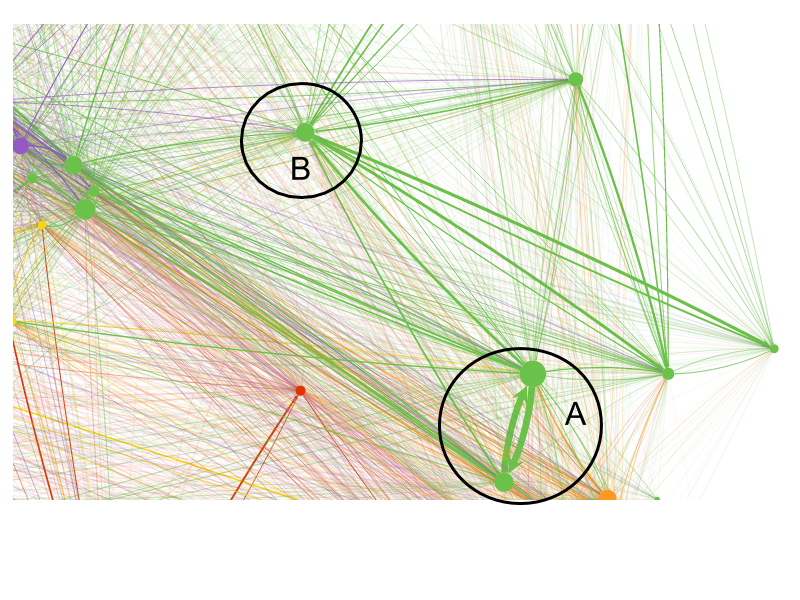 eatest share of their time collaborating with–such as the pair in circle B. Nodes with high “loudness” but a more even distribution of collaboration, such as A in the image, tended to be centered among their collaborators.
Putting it All in Motion
The final piece was pulling together all 18 months of data to see the dynamics of collaboration play out over time. Instead of running the layout algorithm through to convergence for each network, it ran for only the first 28-day window. Then, it updated the nodes and edges to reflect the state of the 2nd 28-day window (which begins 7 days after the first, overlapping with it by 21 days), but leaving the layout alone. Next, it ran the layout algorithm for a few steps and output a single frame with the nodes moved slightly towards their new equilibrium. Repeating the procedure for 36 frames for each of the 72 windows yields this beautiful account of Asana’s growth from 35 to 85 people over the past 18 months.
Looking at Asana
Everyone has some people they work with significantly more than others, but most people work with most other people.
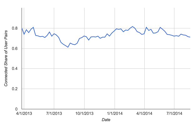
There is a very high level of interconnectedness in Asana’s collaboration network. Community detection algorithms routinely identified small contractors, but could not further subdivide the Asana network into teams. Everyone has some people they work with significantly more than others, but most people work with most other people. In fact, over time, the average user has shared notifications with 70-80% of other Asana employees. Even as the company has grown, this level of interconnectedness has remained a part of Asana’s collaboration pattern, with the average user having some interaction each month with 75% of their coworkers.
Share of Possible User Pairs at Asana that are Connected Over TimeWho Does What Where?
Despite working on separate product development teams, Product Managers’ role in the company pushes them to the center of the collaboration network.
Looking at the non-anonymized versions in the office, we spent hours picking out all of the relationships illustrated and mapping it into our intuitive sense of teams and working relationships in the company. Although the algorithm failed to detect communities, people were generally proximate to whom we expected them to be–and the images didn’t map too far from the physical layout of the office. The individuals who were in the center made sense to us, as did who was more peripheral. There were a few surprises: for instance, we didn’t realize how loud (in terms of generating notifications) our data infrastructure lead was, nor how centered, our data team was–on reflection, the prior year’s build out of infrastructure to support the product and marketing teams likely accounted for this.
Although many people in the company wear several hats, we mapped everyone into a specific role to see how that was reflected in the network. This is an admittedly limiting assumption, and we hope to revisit this analysis with a more fine grained classification that allows for multiple roles. All users were designated as on of Product Management, Engineering, Sales & Marketing, Customer Ops, Ops, Design, and Recruiting. The nodes and edges were then recolored to reflect these role divisions:
Asana’s Asana in September 2014, redux. Each node in the network is an Asana employee or heavily-integrated contractor, colored according to their role, and sized according to how heavily they use Asana. The edges connecting the nodes are measures of how heavily the two connected users collaborate.With these colors, some of the structure of work at Asana become more apparent. The large green cluster are our engineers. At the center are the product-focused engineers. Further towards the edge, having less interaction with sales, marketing, and product management are the infrastructure teams. The triangle at the very bottom center is the Android team, whose intense work on building out a new product produces a very tight collaboration within the team. On the other side of the layout from the infrastructure team are sales, marketing, and non-engineering operations, all of which are highly interconnected with the product teams. Sales & Marketing is the purple cluster in the upper-left, while Facilities and Finance team members are the red nodes on the left side of the layout. The orange nodes in the upper-right are the members of the Customer Operations teams. The designers, in yellow, are less tightly integrated with one another, and tend to be more proximate to the team of engineers and product managers they are currently working with. The dark red outside contractors are occasionally pulled into specific functional clusters, but tend to be far away from most users.
At the center of the network are the roles that function as the nerve center of collaboration in Asana, and acting as a link between development and the customer-facing side of the company. Our product managers are silver, and the two central green nodes are two of our engineering leads: one focused on the business side and the other focused on product. Despite working on separate product development teams, their structural role in the company pushes all of them to the center of the network. Their interaction pattern also reflects their roles: these individuals are characterized as some of the “loudest” nodes in the network (reflected by their relative size), generating on average more notifications than most other users. This is due in part to their active contribution to many tasks as well as their roles as “broadcasters” of information within the network.
Recruiters at Asana also understandably have a central function that interacts with virtually every other role and function coordinating interviews and acting as the social junction between each set of roles and their respective job candidates. They are pink in the static picture above, and have moved to a place between the engineering and sales & marketing team right now, reflecting ongoing engineering recruiting activity. As we will see below, this positioning evolves over time depending on the pace of hiring for different roles.
Product Design and Development: The Asana iOS App
Major initiatives at Asana (like building our iOS app) result in teams separating themselves from other teams
The mobile team offers an interesting example of the structural impacts of specialized teams taking on large dedicated projects. In this version of the visualization, we’ve highlighted the (current) members of the mobile team in orange.
https://vimeo.com/112015282
Before January 2014, several people who will eventually be part of the mobile team are working on other projects in the company. From 1:01-1:07, you can see the company pull together for the weeks surrounding the January 27, 2014 roadmap week, which laid the groundwork for rebuilding the Asana iOS app from the ground up. At 1:04, our newly hired Mobile Product Manager first appears in the network.
As people emerge from planning work, they migrate to proximity with the teams for that episode. The mobile team, with their new product manager, pulls away from the rest of the engineering team and the rest of the company as they kick off the mobile build-out shortly after roadmap week. During the three subsequent months, they worked almost exclusively on it.
At 1:22, the company again pulls together for the May 2014 episode 11 RMW. The Mobile Team’s Product Manager and Engineering lead both appear to be heavily involved in broader company collaboration during this time. The rest of the team, however, appears to remain focused on production, staying far removed from the rest of the engineers. At 1:27, roadmap week passes, and the Mobile Team locks into a new configuration for the duration of the product build-out: isolated from the rest of the company in the collaboration network. Their fort-like configuration on the visualization was mirrored by a fort-like configuration of their desks in the Asana offices during those months. In the weeks since the launch (1:47), the team has started to reintegrate in the network, reflecting them starting to engage on other projects in the company. The Android team, however, the green triangle at the bottom of the image, has maintained the intragroup focus characteristic of new product build outs.
Interns become team members
Interns are rapidly brought into the core of engineering work, though they don’t generally work with the non-engineering side of Asana.
These network visualizations provide a tool for seeing if we achieve some difficult-to-quantify goals as a company. Take our summer internship program, for example. As a company, Asana prides itself on investing in our interns and giving them the opportunity to thrive on advanced projects. One measure of success in this is how fully interns are able to act as team members during the summer. Highlighting them in orange in the videos, a number of things are clear.
https://vimeo.com/112021621
First, as indicated by the relative size of their nodes, all of Asana’s interns are significant contributors at Asana–generating as much work content as many of their more senior coworkers. Second, they were each rapidly integrated into the teams they work with. Within a week of joining, each intern appears to be solidly established within their respective team: one in the mobile team, one in the android team, three in product/data roles, and the rest in infrastructure. However, they do not generally stay long enough to engage in projects with the non-engineering side of the organization, as evidenced by the interns remaining embedded in the engineering side of the company.
Recruiting at Asana
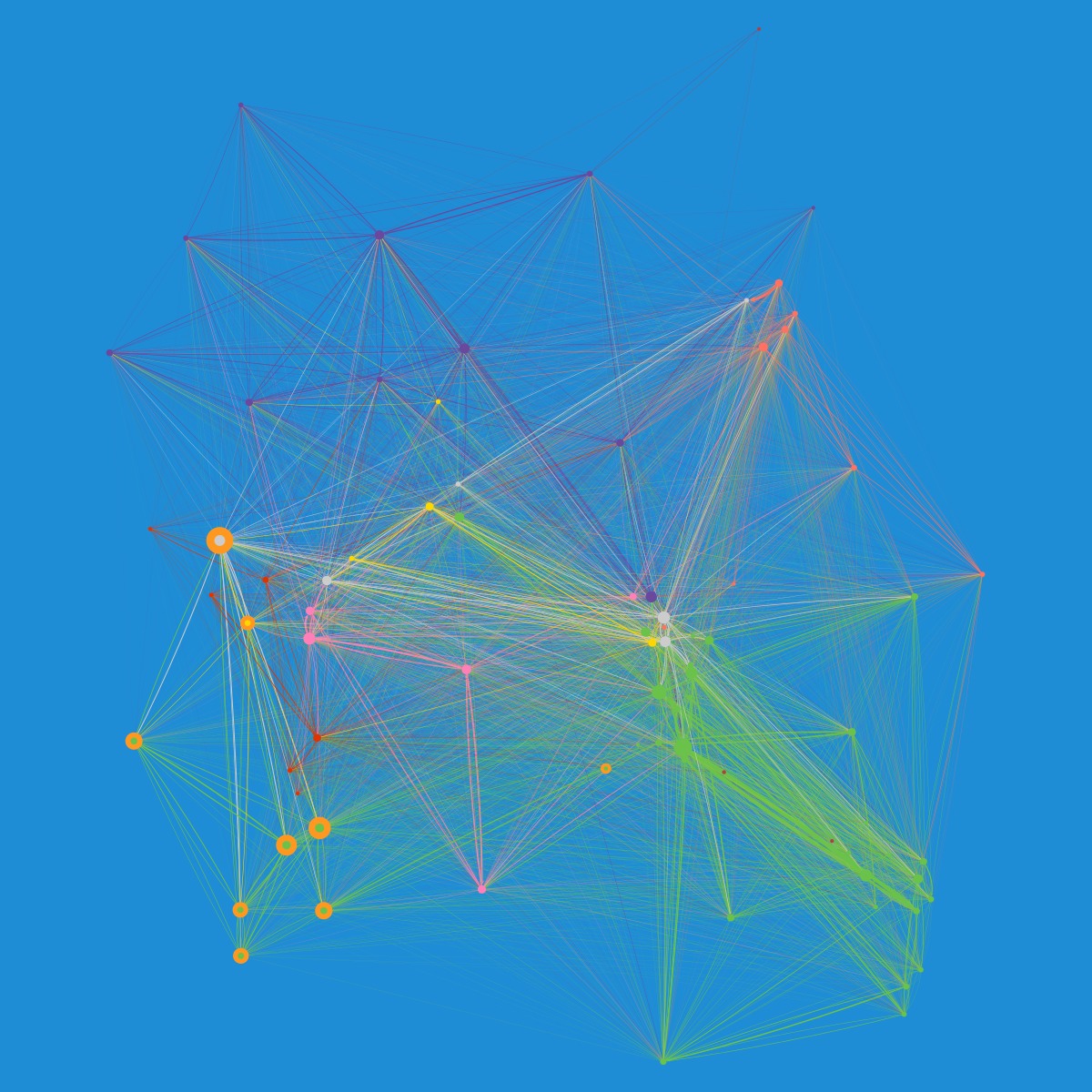
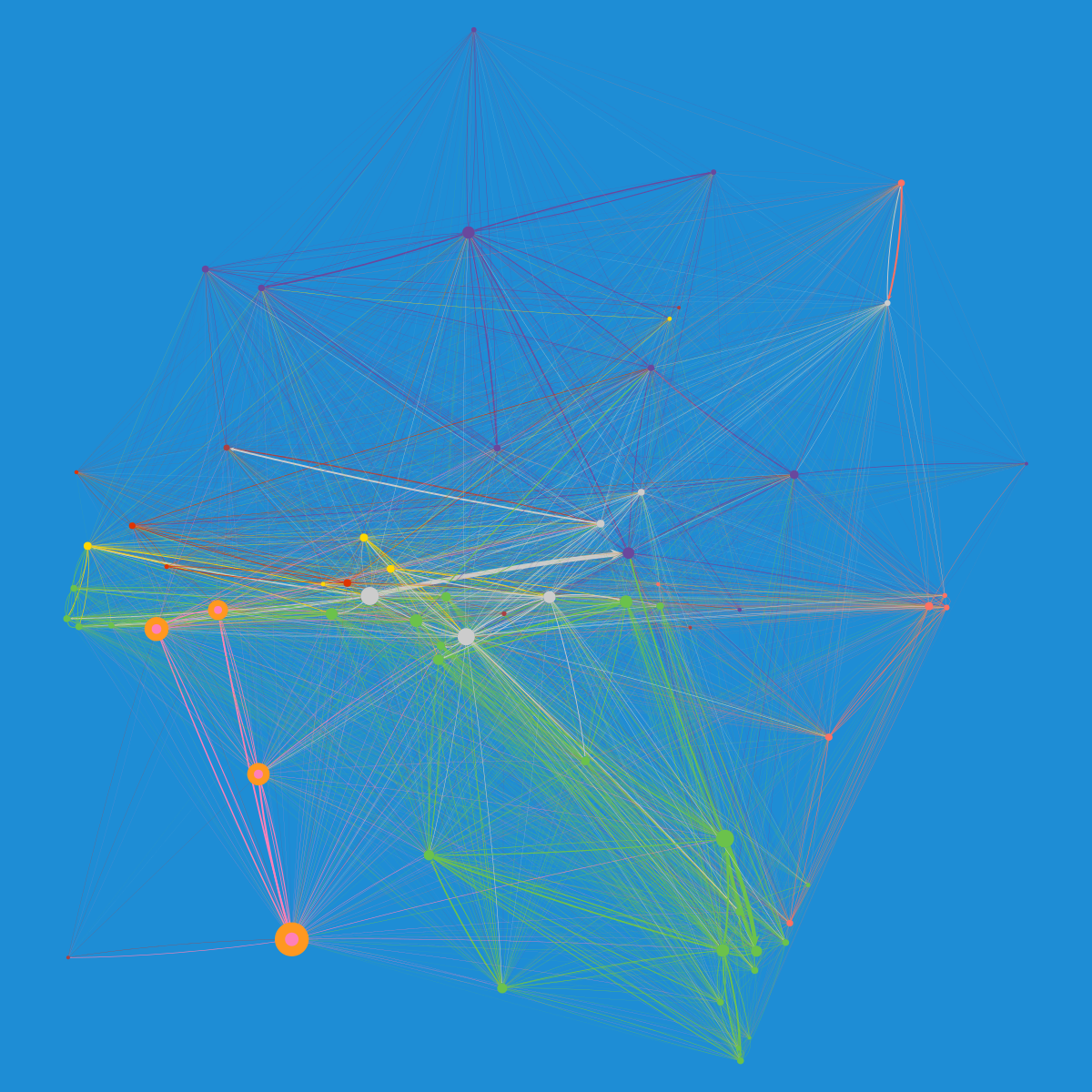
Recruiting at Asana, in pink, highlighted in orange. September 2014.During periods of focused recruiting…recruiting’s interactions would pull them into a structural role that reflects the positions they are hiring for. Once the role is filled, the new hire moves into the hole in the network created by recruiting.
The recruiting team are heavy users of Asana, using it to track their interactions with candidates. As we saw above, they currently occupy a relatively central role in the collaboration network, between engineering and Sales & Marketing. However, this is a relatively new phenomenon. It is interesting to observe how this structural position arose.
Recruiting at Asana, in pink, highlighted in orange. October 2013.In 2013, the recruiting team occupied a structural position analogous to Customer Operations: connected to the engineering and Sales & Marketing teams, but not with intense enough interaction to pull them inward. Insomuch as both recruiters and customer operations people are primarily interacting with individuals outside of Asana, it makes sense that they would occupy similar structural positions.
Recruiting does have an inward-facing role, however, organizing and coordinating candidates’ interviews with current employees. During periods of focused recruiting, this latter point might lead us to expect that recruiting’s interactions during one period would pull them into a structural role that reflects the positions they are hiring for, as they coordinate many interviews between candidates and the position’s future teammates. When hiring an Android engineer, for instance, recruiting team members’ interactions with mobile team members will likely increase, pulling them nearer on the collaboration network. Once the role is filled, if the interviewers were actually teammates of the new hire, we’d expect that hire to move into the hole in the network created by recruiting.
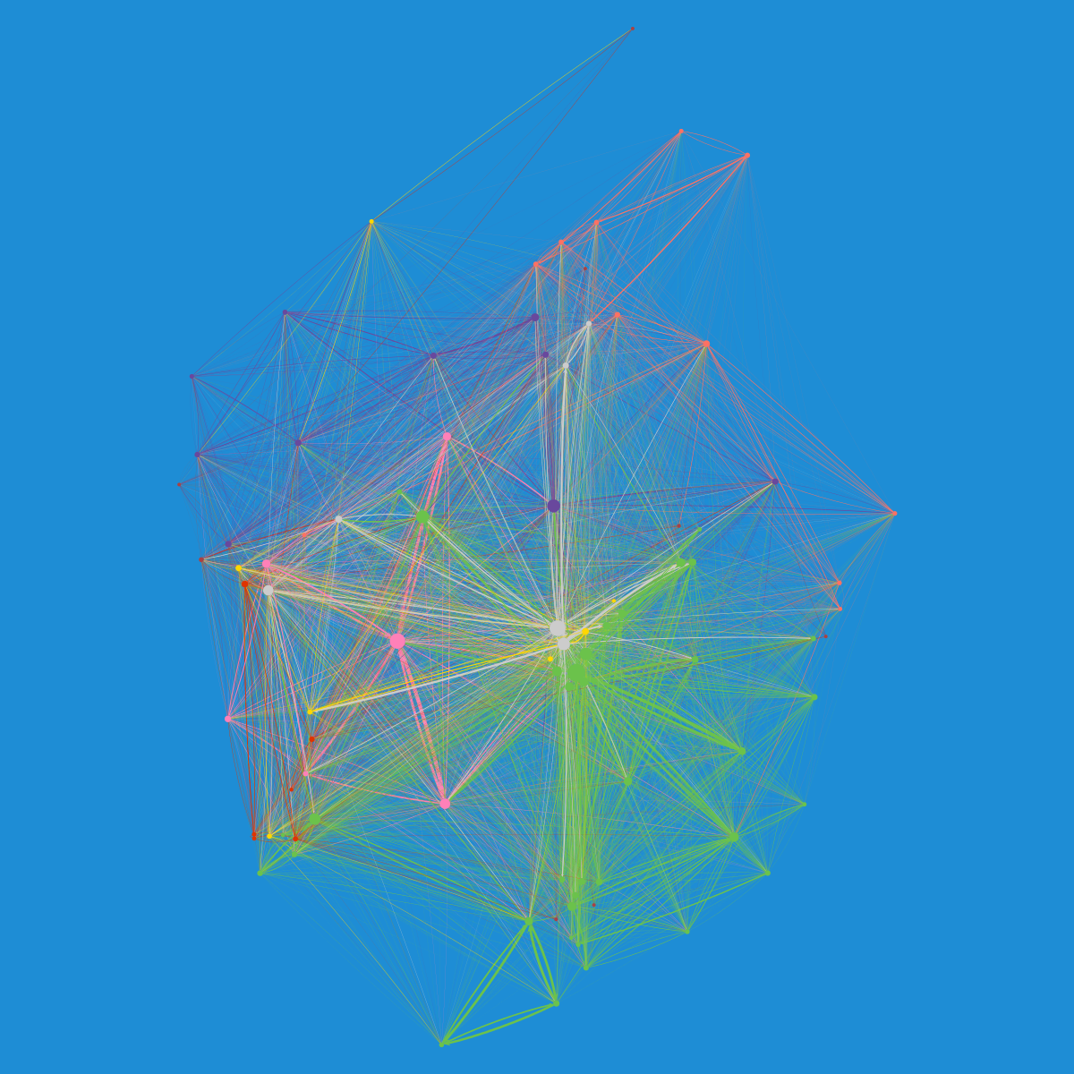
Left: The Recruiting team in January 2014. Right: The Mobile team in June 2014.This effect is very pronounced in the recruitment effort to build out the mobile team in advance of the project described above. At the start of 2014, at 1:01 in the video above, the whole recruiting team pulls off to the left-hand side, just below the newly-clustering (and newly named) mobile team. As each new mobile team member is hired (new hires enter from the lower right), they quickly move into position with the rest of their team. The recruiting team remains tightly linked to the mobile team until 1:26 in the animation. As described above, at this point the May 2014 roadmap week released and the mobile team began their homestretch to product release. Also, this is the moment where a final mobile engineer is added to the team, and the mobile team fully moves into the space the recruiting team had occupied in the network. The recruiting team moves more centrally at this point, reflecting their shift in focus to the non-mobile engineering, customer operations, and sales & marketing employees that enter in the subsequent months.
Looking Forward
These visualizations and discussions offer a preliminary look at what’s possible with analyzing Asana as a dynamic network. There are a few limitations to this approach and assumptions that we’d like to investigate. First, widely-followed projects have the effect of overstating the connections and loudness of the people curating them. The networks may become more meaningful with these broadcast-like projects and tasks removed.
Second, external contractors sometimes play a key role in day-to-day work, and would ideally be represented in the network. Often though, their contribution isn’t directly tied to collaboration and their presence may crowd the image. For now, they are excluded based on how much content they create in Asana, but we’d like to look at more explicit categorization of these people in the future. Finally, the roles reflected in these networks are static, and based on the roles people held in September 2014 (this is, for instance, what leads the “mobile team” having members before it even exists). We’d like to add in functionality for letting labeled roles change over time to make the networks more reflective of the changing nature of individual roles.
There are several directions that we are considering taking this work in the future. For instance, exploring common structural characteristics to see how they relate to Asana usage patterns. Part of this may be digging more deeply into the recruiting case outlined above, investigating if structural holes can be identified in advance. It may be interesting to extend some elements of Kossinets and Watts’ analysis of dynamic communication networks to the organizational context of Asana. Instead of the interpretative view taken in this post, we could start quantifying some of the observations above, such as how isolated the mobile team was, or how significant a structural hole the recruiting team anticipates. Ideally, this would allow us to refine our internal success metrics to target collaboration instead of just user adoption.
Finally, using notifications as a proxy for collaborative activity gives us a good view of the “who with whom when” of work at Asana. However, by ignoring the “what”–the specific projects and tasks engaged by particular users–it gives up what may be the richest insights of the underlying data. One future direction for this research is to use latent variable block models to automate community detection in a way that fully leverages these data. In Asana’s highly interconnected workspace, identifying teams from notification patterns alone is impossible, but this might open the possibility for automated team detection, especially if we use models that allow for multiple classification of individuals. This would give us an even richer understanding of how Asanas get things done in Asana.
